Configure your Widget layout and appearance with this quick explainer article
🧰 What You Will Need
- Some uploaded media
- A Widget
Step 1 - Access your Widget
Go to the Apps page and pull up the widget you want to customize. The page you see now will be referred to as the Widget Editor.

Step 2 - Customize your widget
You can apply various styling elements to customize your Widget on Membership.io via the "Styling" tab below the widget title. Please follow along as we go through these styling options.
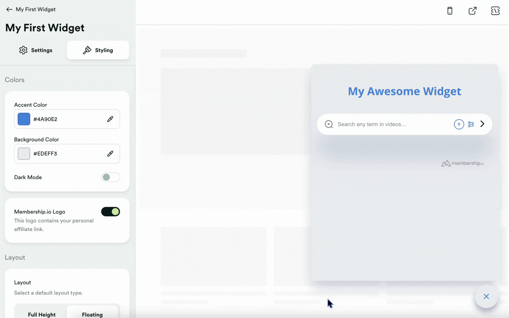
Colors
You can choose colors that complement your branding for the accent and background to achieve a unified look for your widget. You can switch to dark mode anytime, providing a unique visual experience for your audience.
Additionally, you can show or hide the Membership.io logo on your widget (depending on your subscription). Remember that this logo contains your personal affiliate link.
Layout
This section has three customizable subsections: Layout, Alignment, and Button Type.
Layout refers to the screen space the widget takes up when activated. You can choose between Full height and Floating as your default layout type.

The Alignment is where you can position the widget on the Left or Right of the canvas. Please note that this WILL NOT change the widget button and where/how it appears.

The Button Type lets you choose between two options.
A Custom button type will add code to the widget embed that you can customize on your site to match any style or design you wish. As long as the "href" code we provide in the button is unchanged, the widget will be activated when your audience clicks it. By default, this "button" will be a hyperlinked text that reads "Open Widget".
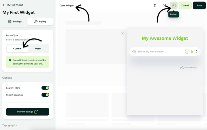
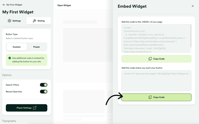
The above screenshot shows the "href" code you want to avoid changing.
The other button type is a Preset, which uses a default button style and allows you to choose its location on the screen. Notice that the button changes location as you select different positions in the dropdown.
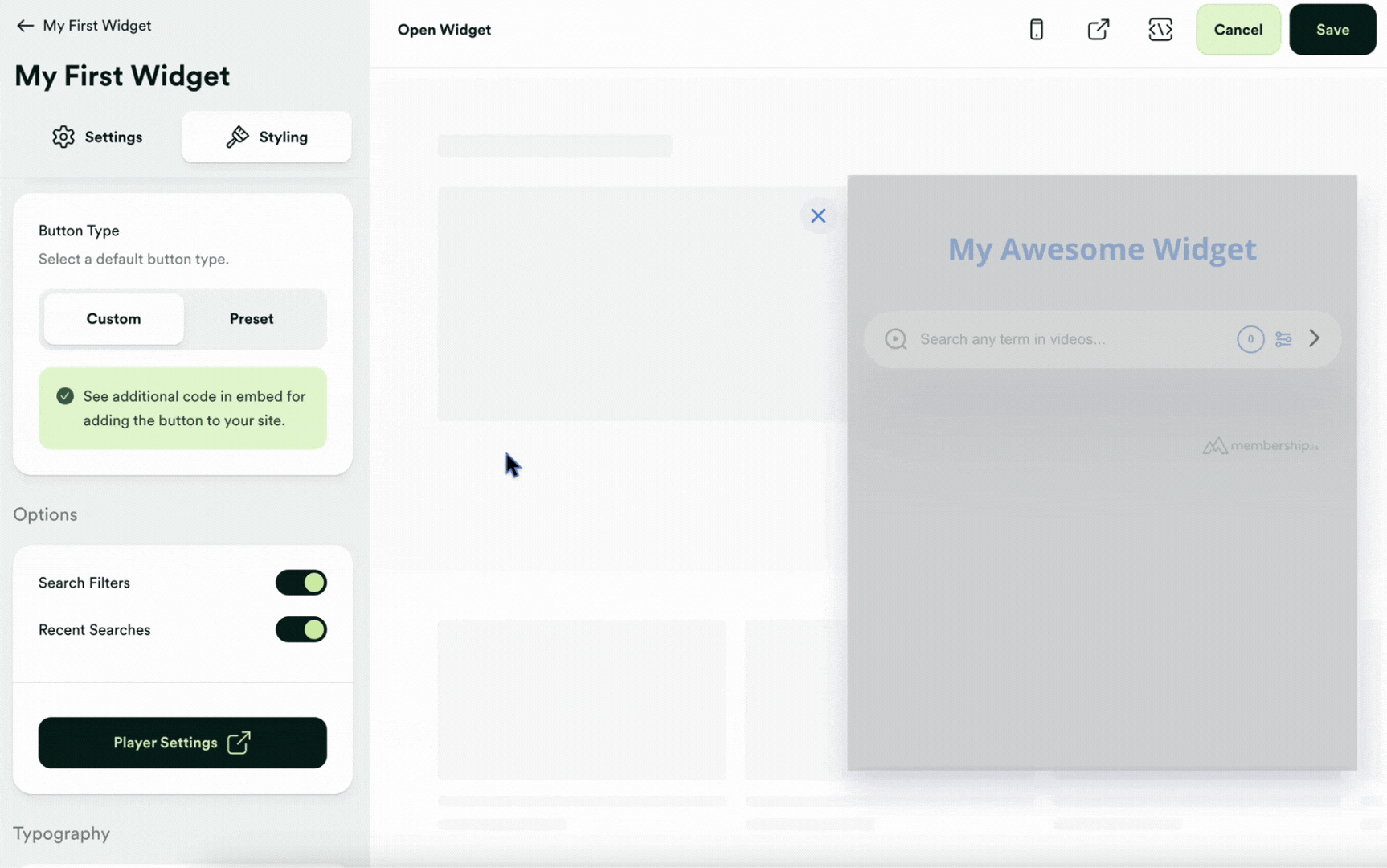
Options
There are other toggles you can customize after the button type, including whether or not to show your audience their recent searches and allow for filtering, so be sure to play around with those too before moving on.

Typography
Select a font that complements your brand effectively. You can preview different font options on the Google Fonts page to find the perfect match. There are 1400+ fonts that you can choose from!
Theme
Want to give your audience an example of a term they can search? You have the option to customize the placeholder text in the search bar, providing a guide or prompt users with specific messages or instructions. For example, users can set the placeholder text to say "Start searching for content here..." to improve user experience and make searching more intuitive.
If you don't want your audience to see the date associated with your content, there's a toggle button for showing/hiding dates in your search results.

On the Start Plan or higher? Remove the Membership.io logo to integrate the widget into your site seamlessly (know that the logo is your affiliate link and anyone who clicks it and signs up for Membership.io will provide you with a 30% commission on any of their payments).
These options make the widget look like another sweet perk of consuming your content by matching it to your brand and business. Play around with the various options and share your final product on our social channels!
📚 Up Next